Real.de Grocery Checkout
How a structural rethink of the checkout flow — not a redesign — reduced drop-off at one of Germany's largest online grocery platforms.

Situation
A wall of decisions. Every single day.
Every day, thousands of people in Germany order groceries online through Real.de. Unlike non-food e-commerce, grocery shopping is uniquely complex: a single cart can hold 40–60 items, and choosing a delivery timeslot isn't a minor detail — it's often the deciding factor in whether someone completes the order or abandons it entirely.
The existing checkout was a single-page experience. On paper, this sounds efficient — no page loads, everything in one place. In practice, it created a wall of decisions that left users disoriented, unsure of where they were in the process, and — critically — unsure of what they were about to pay.
The drop-off rate told the same story the users couldn't articulate themselves. My task: figure out why people were leaving, and find a better way.
Process
Going deep before going wide
Before sketching a single solution, I spent time understanding the problem from multiple angles — qualitative and quantitative, live data and user behaviour.
- Understand Usability testing of the live checkout, Contentsquare heatmaps & rage-click analysis, Google Analytics funnel data, competitor benchmarking, NNg e-commerce report
- Explore Design sprint: HMW framing, Dot voting, Success metrics definition, Crazy 8s, Solution Sketch — cross-functional with product and engineering
- Materialise Prototype usability testing, high-fidelity design handoff, implementation QA and A/B test setup
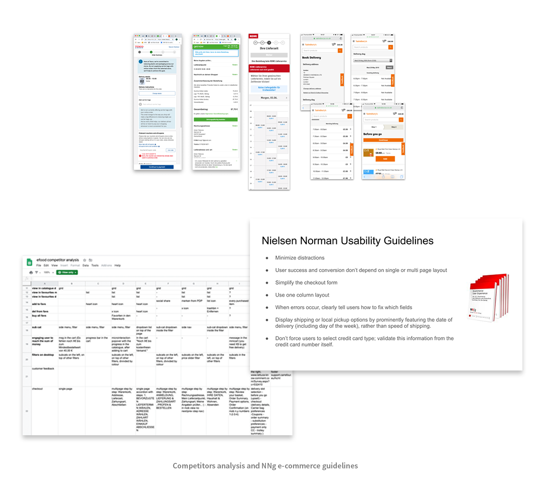
Competitor analysis and NNg e-commerce guidelines shaped the initial framing.
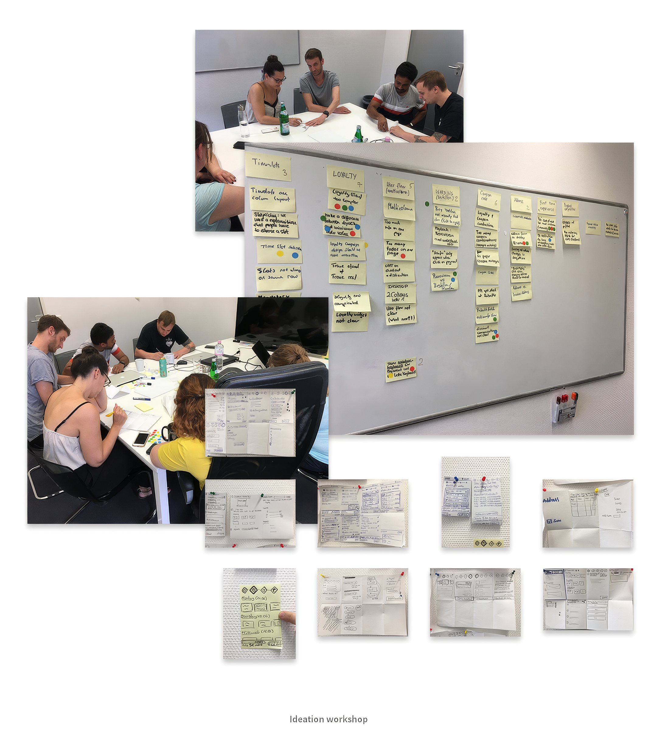
Ideation workshop: HMW framing, dot voting, Crazy 8s with product and engineering.
Key Insight
The obvious answer would have been wrong
The easy path was to copy the non-food checkout from the same platform — it was already battle-tested and familiar to the team. But grocery ordering is a fundamentally different behaviour.
Why grocery ≠ non-food checkout
More items per cart. More cognitive load. And one critical moment — when will this arrive? — that non-food checkout treats as a footnote. In grocery, the delivery timeslot is a primary decision, not an afterthought. That gap became the key insight.
Usability testing confirmed it. Users would scroll up and down the single-page checkout, lose the timeslot selector, re-read the price summary multiple times, then hesitate — or leave. Contentsquare data showed disproportionately high rage-clicks and drop-off precisely at that step.
"The single-page format wasn't simplifying the process. It was hiding progress."
The sprint surfaced a clear hypothesis: users couldn't tell how close they were to finishing. The price kept changing as they scrolled. The delivery window felt buried. The problem wasn't the content — it was the structure.
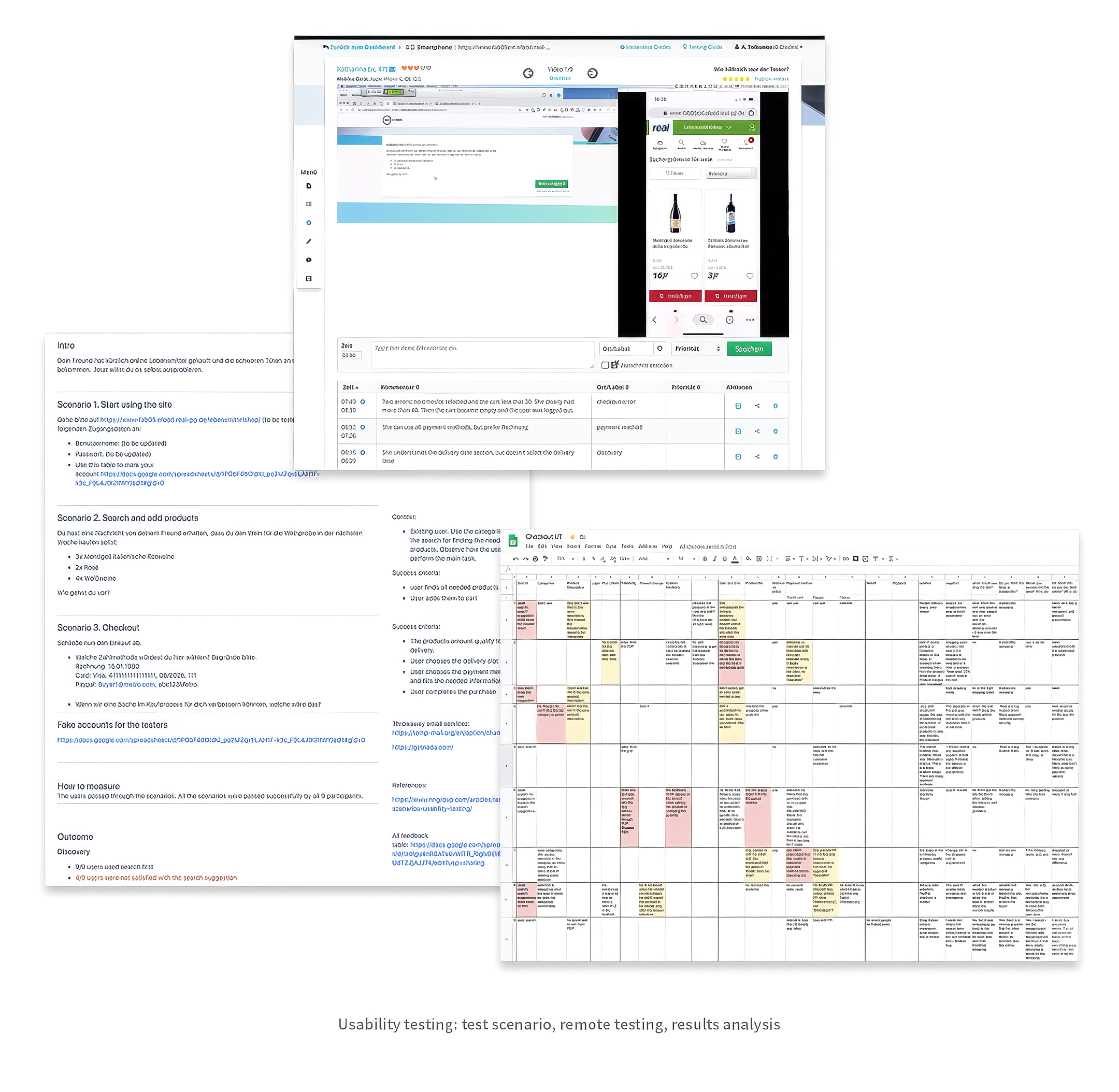
Usability testing: scenarios, remote sessions, and structured feedback analysis.
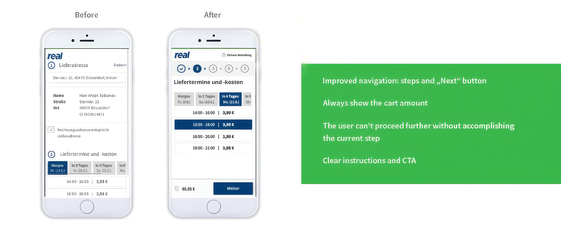
Before: everything collapsed into one scrollable page. After: clear steps, persistent price, prominent timeslot.
Solution
Small change on the surface. Meaningful change underneath.
The idea wasn't radical — it was structural. Break the checkout into clearly named steps. Surface the timeslot selection earlier and more prominently. Keep the total price always visible, no matter which step the user is on.
We prototyped the multi-step flow and ran another round of usability testing. The difference was immediate. Users moved through the checkout without backtracking. They selected their delivery window confidently. When asked "how close are you to finishing?" — they knew the answer.
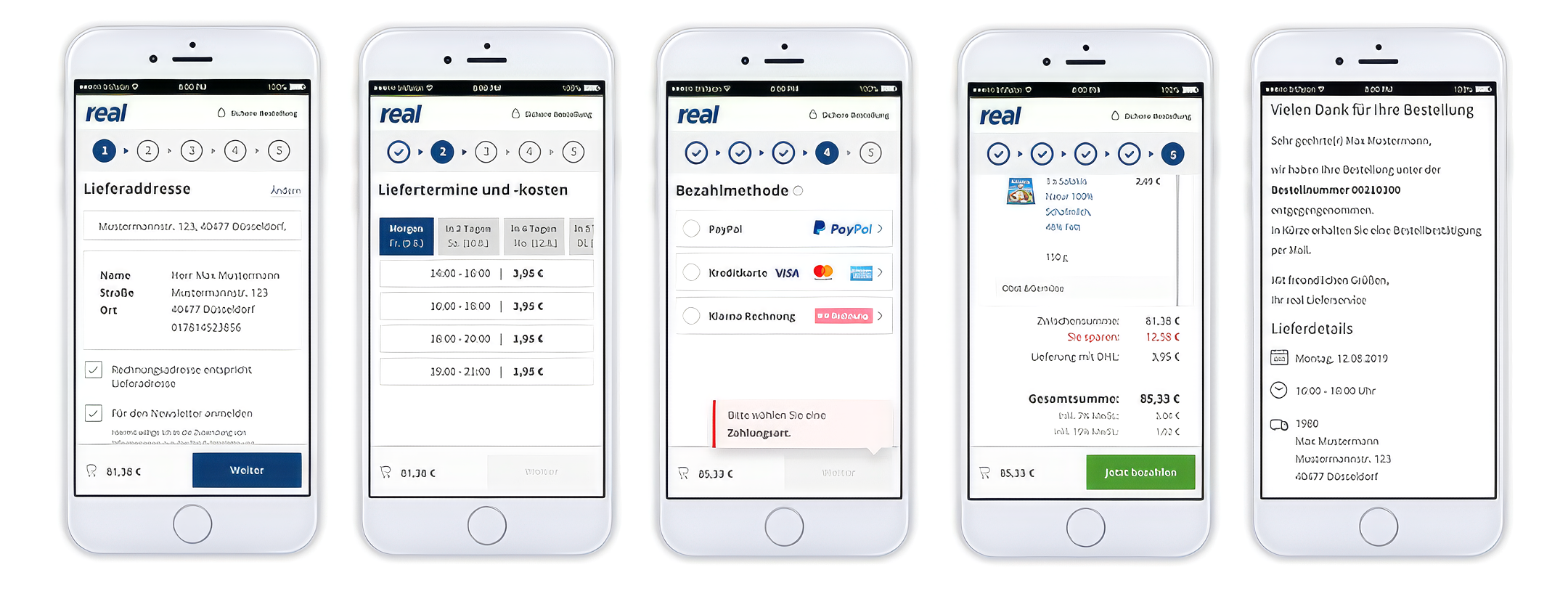
The final five-step flow: address, delivery timeslot, payment, summary, confirmation.
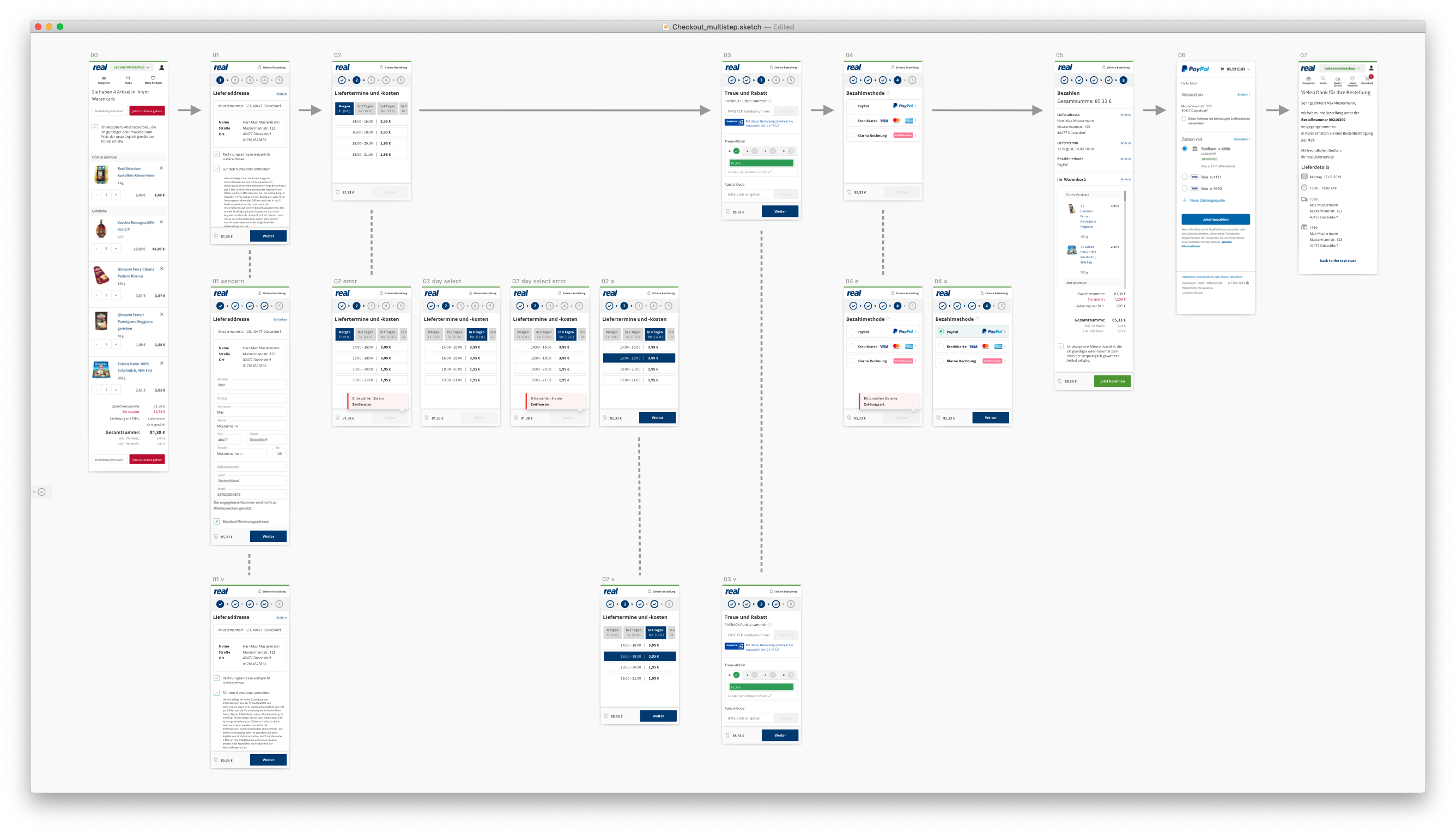
Full user flow with edge cases: the wireframe that went into usability testing and engineering handoff.
Result
Validated by data, confirmed by users
The A/B test showed a significant improvement in drop-off rate. Not because we reinvented the wheel — but because we listened closely enough to understand this specific user, with this specific task. Deep research delivered a more precise solution than pattern-matching to what already existed elsewhere on the platform.
The most impactful design changes are sometimes the ones that look smallest from the outside. The real work is in understanding why something isn't working — not just reaching for the obvious fix.